CSS issue with Firefox and Opera
Update – The Opera team has responded very quickly to fix the bug regarding positioned elements with a rotate transformation, on the next iteration of their browser, 12.10.
In this post I explain two issues I ran into when creating the “logo” for this site. One occurs on Firefox and Opera 12.02 when using the border, box-shadow, and border-radius properties on one element, and the other appears on Opera when attempting to rotate an element 180degrees that has a position of either absolute, or fixed.
- Opera 12.02
- Firefox 15.01
A process all of us (should) go through when developing a web page is testing it on various browsers (usually the big 4) to ensure that it renders correctly in all of them. Now, if like me, you’re working on a Mac, you’re going to have a problem when in comes to testing on Internet Explorer. Fortunately, there are a few solutions that can help you with this. I wont go into extensive detail about them since this post isn’t about that, so here’s a very short list:
- NetRenderer – A website that allows you to enter the url of a web page and specify which version of IE you wish to test it on. In my (brief) experience with it, it returns images of rendered pages quickly and accurately.
- Browsershots – Basically the same as NetRenderer with the added ability to test on pratically any browser in existance. However, unlike NetRenderer, once you submit a URL it is added to a job queue so you have to wait for your job to come up before you’re able to get a preview of your site. Don’t get me wrong though, it’s a fantastic service, and it’s free so waiting a short while for your job to be processed is small price to pay.
- Wine – Is a compatibility layer which allows you to run Windows applications without Windows. However, a quick glance on their AppDB page they list their IE6 version as garbage, and the other versions don’t fare much better. Additionally, their version might render pages differently to the Windows version, so it might not be the best way to go. Nonetheless, it’s an option. Also, if you’re not too fond of compiling from source, you can easily install it using Homebrew.
- VirtualVM Fusion A virtual machine that allows you to run Windows (or any other OS). Once you get Windows running, you can install anything you want and test your heart out.
Anyway, back to business. When ‘designing’ this site, and I use that term very loosely, I wanted to use no images and rely mostly on CSS3 to achieve the look I wanted. With the exception of the grainy background of the sidebar, I feel like I managed to achieve this. The biggest issue I faced was designing my ‘logo’. I should note that this site uses LessCSS which is a dynamic stylesheet language, so if some properties don’t make sense, chances are they’re a part of LessCSS syntax.
div.logo {
	.easeinoutlogo(3s);
	position: absolute;
	right:-52px;
	top:20px;
	height: 100px;
	width: 100px;
	.border-radius(50%);
	background: #ca314a;
	border:10px solid #fff;
	.box-shadow(inset 0px 3px 3px #7e2433);
	z-index: 2;
	overflow:hidden;
}
The code above would render the logo absolutely fine (as seen on the site) on Webkit browsers, but on Firefox and Opera there would be a strange border which is visible against lighter colours, as seen below.
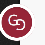
This issue seems to arise when using a combination of border, box-shadow, and the border-radius properties on one element. The solution for this problem was relatively straightforward, and it was to replace the border with another box-shadow like so:
.box-shadow(~"0px 0px 0px 11px #fff, inset 0px 3px 3px #7e2433");The other issue I ran into was when rotating the second letter ‘G’ 180 degrees on Opera. It seems that it doesn’t like that very much (Open that link on Opera). Rotating the element to any other degree will work fine, but if you rotate it 180/-180 degrees and set the position to either absolute or fixed, the transformation will be ignored. Anyway, the upside-down letter G on Opera has been rotated 179 degrees in the meantime since visually there is very little difference.